Highcharter是基于HighCharts javascript库及其模块的R包。这个包的主要功能是:可以创建交互式的各种图表,如散点图、气泡图、时间序列、热图、树形图、条形图等;支持各种R对象;支持Highstocks图表、Choropleths;支持管道方法和各种各样的主题与外观。
Highcharter有两个主要函数:从数据创建图表,向现有对象添加数据。
hchart():一个泛型函数,它接受一个对象(如向量、时间序列、数据框、likert对象等)并返回一个对象(chart),和ggplot2中qplot()用法类似。
hc_add_series():根据数据的类型将数据添加到现有对象的通用函数,和ggplot2中geom类似。
**hcaes()_**:和ggplot2中ase()用法相似。
准备数据
data("mpg", "diamonds", "economics_long", package = "ggplot2")head(mpg)
## # A tibble: 6 x 11## manufacturer model displ year cyl trans drv cty hwy fl class ## <chr> <chr> <dbl> <int> <int> <chr> <chr> <int> <int> <chr> <chr> ## 1 audi a4 1.8 1999 4 auto(l5) f 18 29 p compa~## 2 audi a4 1.8 1999 4 manual(m5) f 21 29 p compa~## 3 audi a4 2 2008 4 manual(m6) f 20 31 p compa~## 4 audi a4 2 2008 4 auto(av) f 21 30 p compa~## 5 audi a4 2.8 1999 6 auto(l5) f 16 26 p compa~## 6 audi a4 2.8 1999 6 manual(m5) f 18 26 p compa~
基本图形
基本的绘图语法
hchart(<data.frame>, <type_of_chart>, hcaes(<aesthetics>), ...)
一个示例
hchart(mpg, "point", hcaes(x = displ, y = cty, group = year))

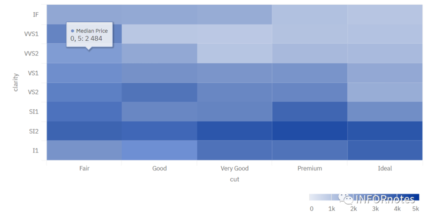
制作一个热图
library(dplyr)dfdiam <- diamonds %>% group_by(cut, clarity) %>% summarize(price = median(price))hchart(dfdiam, "heatmap", hcaes(x = cut, y = clarity, value = price), name = "Median Price")
添加其他参数
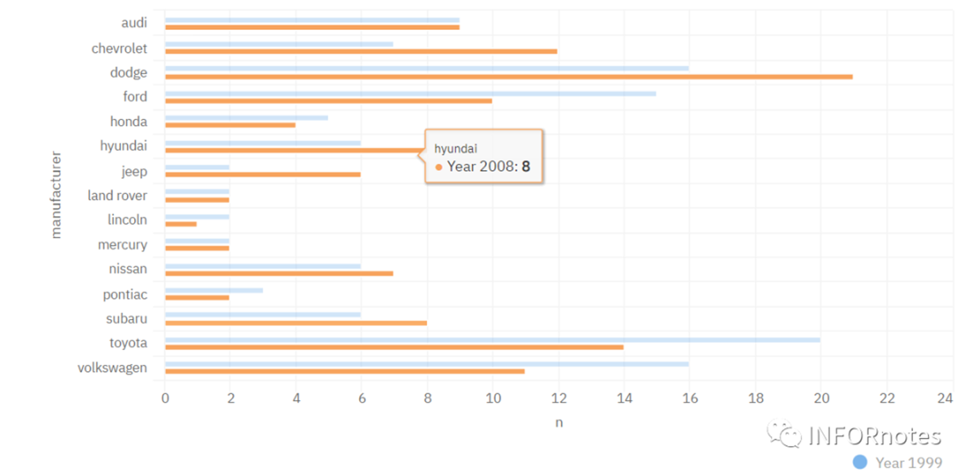
添加其他参数以修改每个组的名称。这些名称在图例和工具提示中使用。还可以修改颜色和其他属性。
mpgman2 <- count(mpg, manufacturer, year)hchart( mpgman2, "bar", hcaes(x = manufacturer, y = n, group = year), color = c("#7CB5EC", "#F7A35C"), name = c("Year 1999", "Year 2008"), showInLegend = c(TRUE, FALSE) # only show the first one in the legend )
更高级的图形绘制
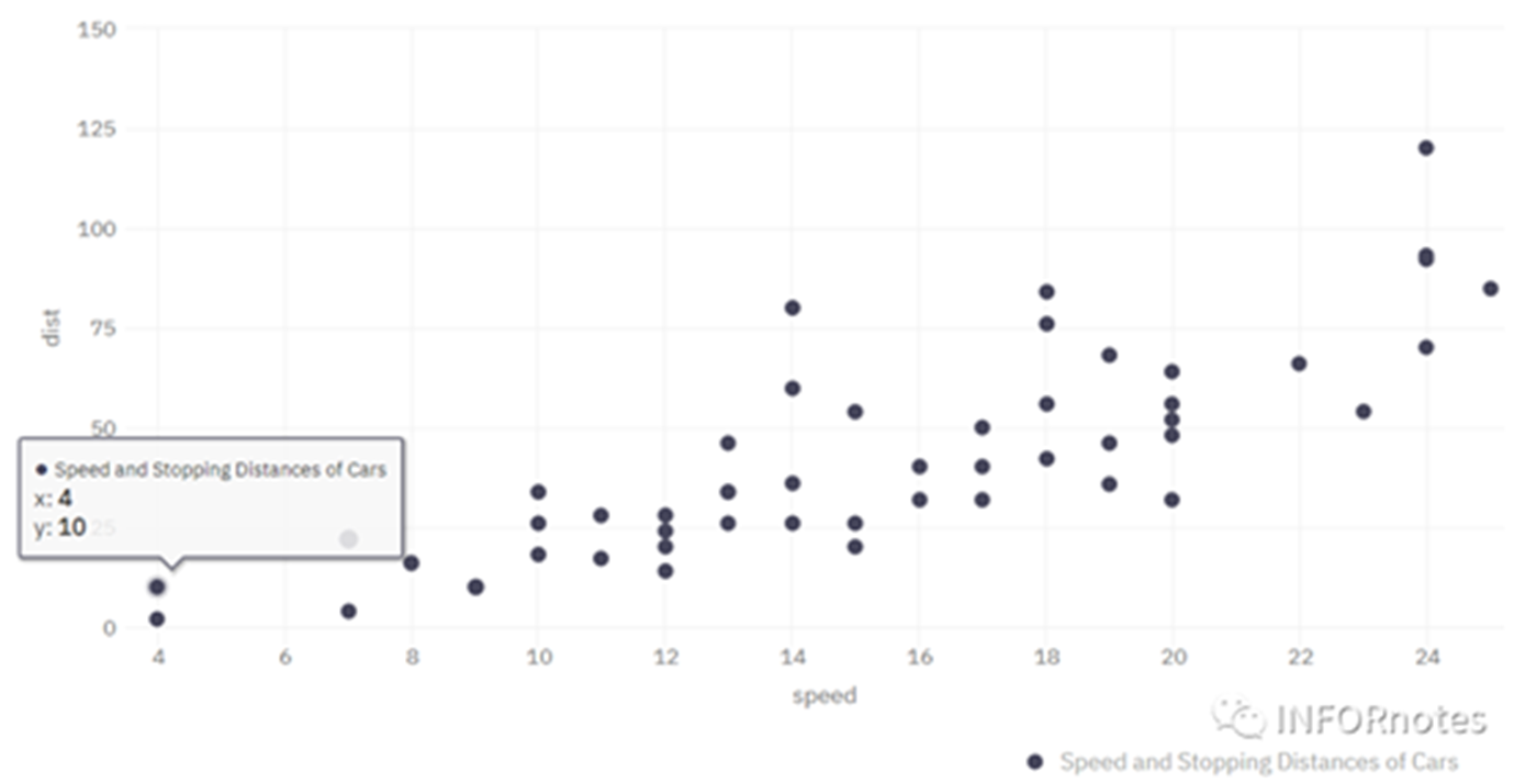
首先绘制原始数据图表,并存储在变量中
library(broom)modlss <- loess(dist ~ speed, data = cars)fit <- arrange(augment(modlss), speed) %>% mutate(.se = predict(modlss, se = TRUE)$se.fit)hc <- hchart( cars, type = "scatter", hcaes(x = speed, y = dist), name = "Speed and Stopping Distances of Cars", showInLegend = TRUE )hc
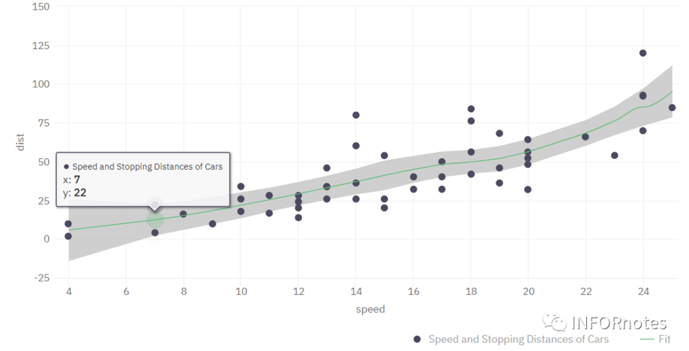
使用hc_add_serieschart()向图表中添加更多的series(就像ggplot中的图层一样)。
在本例中,将添加2组series,样条线和面积范围。
qtint <- qt(0.975, predict(modlss, se = TRUE)$df)hc %>% hc_add_series( fit, type = "spline", hcaes(x = speed, y = .fitted), name = "Fit", id = "fit", # this is for link the arearange series to this one and have one legend lineWidth = 1, showInLegend = TRUE ) %>% hc_add_series( fit, type = "arearange", name = "SE", hcaes(x = speed, low = .fitted - qtint*.se, high = .fitted + qtint*.se), linkedTo = "fit", # here we link the legends in one. showInLegend = FALSE, color = hex_to_rgba("gray", 0.2), # put a semi transparent color zIndex = -3 # this is for put the series in a back so the points are showed first )
转载自《生信技能树》,如有侵权,请联系删除。